Discover how to boost website conversion with popups. Proven strategies, examples, and ready-to-use solutions for your business.
Popups are a powerful tool for increasing conversion rates. However, poor implementation can annoy users. Here are 10 proven practices to boost sales without harming UX.
1. Optimal Timing
- Delay 15-30 seconds — let users explore the site first.
- Exit-Intent — triggers when the cursor moves to the close tab.
- After scrolling 50% — the user is already engaged.
2. Clear Call-to-Action (CTA)
- Use action verbs: “Download”, “Buy Now”, “Get Offer”.
- Contrasting button color (orange, green, red).
3. Minimalist Design
- 1 headline + 1 CTA + short description.
- Max 2 font types.
4. Personalization
- Dynamic text: “Hi [Name]! Your coupon: WELCOME10”.
- Behavior-based: discount for abandoned carts.
5. Mobile Optimization
- Close button at least 40×40 pixels.
- Vertical layout.
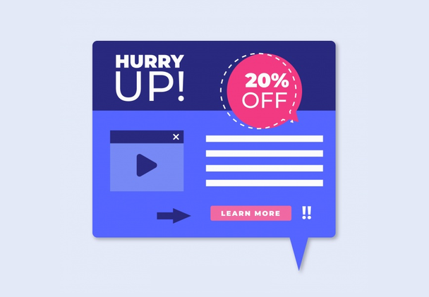
6. Urgency & Scarcity
- Countdown timer: “Only 2 hours left”.
- Limited stock: “Last 3 items at this price”.
7. Free Offer
Checklists, discounts, free shipping.
8. A/B Testing
Test CTA text, button color, position.
9. Social Proof
“256 people bought this today”.
10. Easy to Close
- Visible “X” button.
- Don’t show more than once every 24 hours.