Popups are a powerful tool for boosting conversions, but their use on mobile devices requires a special approach. This article explores key features and best practices for creating mobile-friendly popups to enhance UX and drive sales.
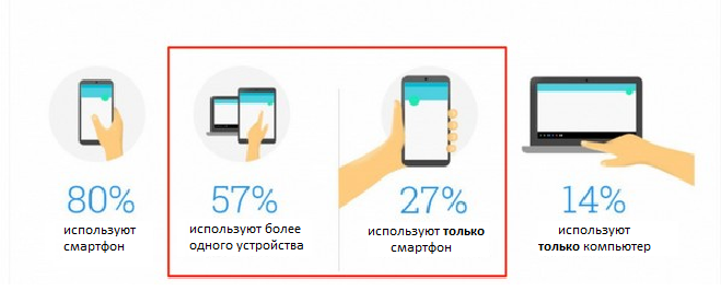
With the rise of mobile traffic, popups have become a key marketing tool. However, poor implementation can annoy users and hurt conversions. How to make mobile popups effective?
1. Mobile Popup Specifics
✔ Small screen – popups shouldn’t block content.
✔ Loading speed – avoid heavy animations.
✔ Easy navigation – the close button must be accessible.
2. Best Practices
✅ Responsive design – fits any screen size.
✅ Minimalism – short text + one CTA button.
✅ Scroll/time triggers – don’t show popups immediately.
✅ Simple forms – e.g., email-only fields.
✅ A/B testing – find the highest-converting variants.
3. Top Mobile Popup Types
🔹 Discount coupon – boosts purchases.
🔹 Email capture – for future marketing.
🔹 Cookie consent – GDPR compliance.
🔹 Feedback request – improves UX.
Conclusion: Well-optimized mobile popups increase conversions without harming user experience.